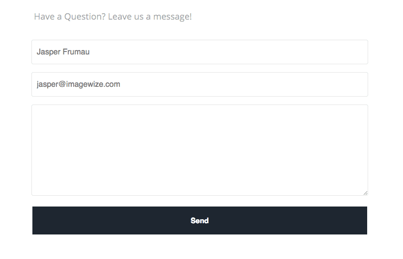
Basic Contact Form 7 CSS styling is horrible. Here a basic setup in CSS I have been working on and will update from time to time. A gist at Github I set up based on one by codehandling. Make sure you do not use the labels and that you check the configuration.
Basic Form Configuration
In Contact Form 7 remove the labels and add placeholders. This will make the form look way more modern and appealing. Here is the basic setup:
[text* your-name placeholder "name"]

[email* your-email placeholder "email"]

[textarea your-message class:comment-form]

[submit "Send"]
As you can see the basic labels have been removed and placeholders have been added for the name and email fields.
Complete Contact Form 7 CSS Boilerplate
So here the actual Contact Form 7 CSS Boilerplate I was talking about. Take it and tweak it to your liking. This setup is responsive and shows a decent form without labels and with placeholders. I have made the fields cover the full width of the form, not just half. I also gave the fields nice rounded corners and a decent submit button.Text in the fields is styled too.
Here is the complete Contact Form 7 CSS Boilerplate:
/***********basic************/

/*Form width*/
.wpcf7 {
    text-align: left;
    width: 90%;
}

/*Input Field widths*/
.wpcf7-text, .wpcf7-textarea {
    width: 100%;
    border: 1px solid #e4e4e4;
    border-radius: 4px;
}

.wpcf7-text {

	height: 50px;
    padding-left: 10px;

}
.wpcf7-text:focus, .wpcf7-textarea:focus {
    border-color: #129FEA;
}

/*Label Font*/
.wpcf7-form p {
    font-size: 16px;
    font-family: 'Roboto', sans-serif;
}

/*Submit button Font*/
.wpcf7-submit {
    width: 85%;
    font-size: 15px !important;
    background: #4a97c2 !important;
    color: #fff !important;
    padding: 20px;
}

/*Submit button Hover*/
.wpcf7-submit:hover {
    background: #3b86b0 !important;
}

/*Response messages - Error & Success*/
.wpcf7-response-output {
    margin-bottom: 30px !important;
}

/***********borders************/

/*Form border*/
.wpcf7 {
    padding: 20px 25px !important;
    padding-bottom: 0px !important;
}

/*Input Field borders*/
.wpcf7-text:focus, .wpcf7-textarea:focus {
    border-color: #8F8F8F !important;
}

/*Submit button Background*/
.wpcf7-submit {
    background: #7E7E7E !important;
    color: #fff !important;
}

/*Submit button Hover*/
.wpcf7-submit:hover {
    background: #5F5F5F !important;
}

/***********colors************/

/*Submit button background & border*/
.wpcf7-submit {
    background-color: #1d2731 !important;
    border: 2px solid #5A5050 !important;
    color: #5A5050 !important;
    font-weight: bold !important;
}

/*Submit button Hover styles*/
.wpcf7-submit:hover {
    background-color: rgba(29, 39, 49, 0.66) !important;
    border-color: #4CAF50 !important;
    color: #4CAF50 !important;
}

/*Label Text color*/
.wpcf7-form p {
    color: #FFF;
}

.wpcf7-form label{
	/*display: none;*/
}

/*Input Field Text color*/
.wpcf7-text, .wpcf7-textarea {
	color: #777;
}

/****background-images********/

/*Form background*/
.wpcf7 {
    /*background-image: url(http://i.imgur.com/iAFPf0G.jpg);*/
    background-color: rgba(255, 255, 255, 0.2);
    background-position: center;
    background-size: cover;
}

/*Label Text color*/
.wpcf7-form p {
    /*display: none;*/
    /*color: #000000;*/
}

/*Submit button background & border*/
.wpcf7-submit {
    border: 2px solid #FFFFFF !important;
    color: #FFFFFF !important;
}

/*Submit button Hover styles*/
.wpcf7-submit:hover {
    border-color: transparent !important;
    background-color: rgba(0, 0, 0, 0.2) !important;
    color: #FFFFFF !important;
}

/*Input Field border*/
.wpcf7-text:focus, .wpcf7-textarea:focus {
    border-color: #5A3D3D !important;
}
NB Here the Gist File at Github Gists.
End Result
The end result I will show you now with a screenshot. The theme itself is not quite done yet. Once it is up for sale I will update this post.

Fork it, adjust it to your liking. If you enjoyed it do leave a comment or link to the blog post. Appreciate it.