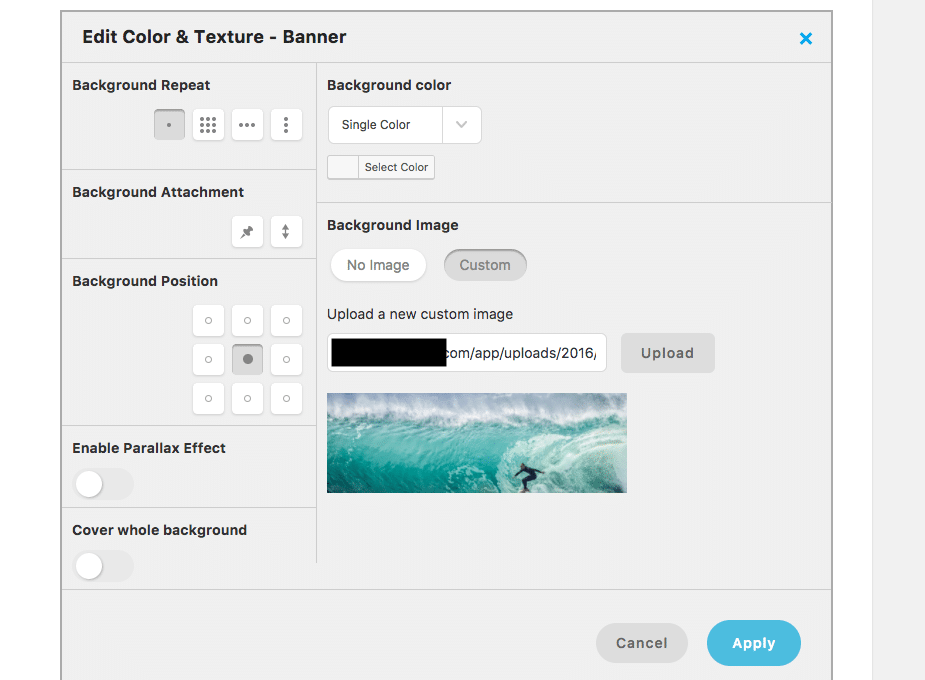
Background Color & Texture

- top left,
- top center,
- top right,
- center left,
- center center,
- center right,
- bottom left,
- bottom center and
- bottom right.
CSS Background Position
With CSS you can position the background image more fine grained with percentages or using a fixed amount of pixels. This allows you to position these images the way you want. Especially useful when you add portrait size images and need to make them fit and display well. You could make all these title background images taller to make things fit. But then at about 700px height they will take up too much space really. Visitors like images, but also need to be able to read text right away.
So what I did is add:
.page-template-default .mk-header {
background-repeat: no-repeat;
background-position: 20% 35%;
}
to the Visual Composer’s CSS for that page. This piece of CSS with your own choice of percentages for the background-position allows for you to tweak the background image position to your heart’s desire. I do hope we will be able to do this without CSS in the future with Jupiter but for now this seems to be the way to go.